Montenegro Airlines
Client: Montenegro Airlines
Services: Brand redesign
Years: 2016

Client: Montenegro Airlines
Services: Brand redesign
Years: 2016

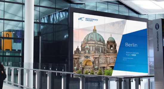
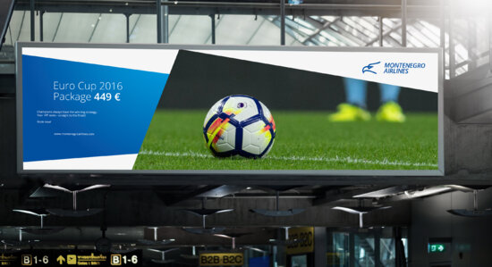
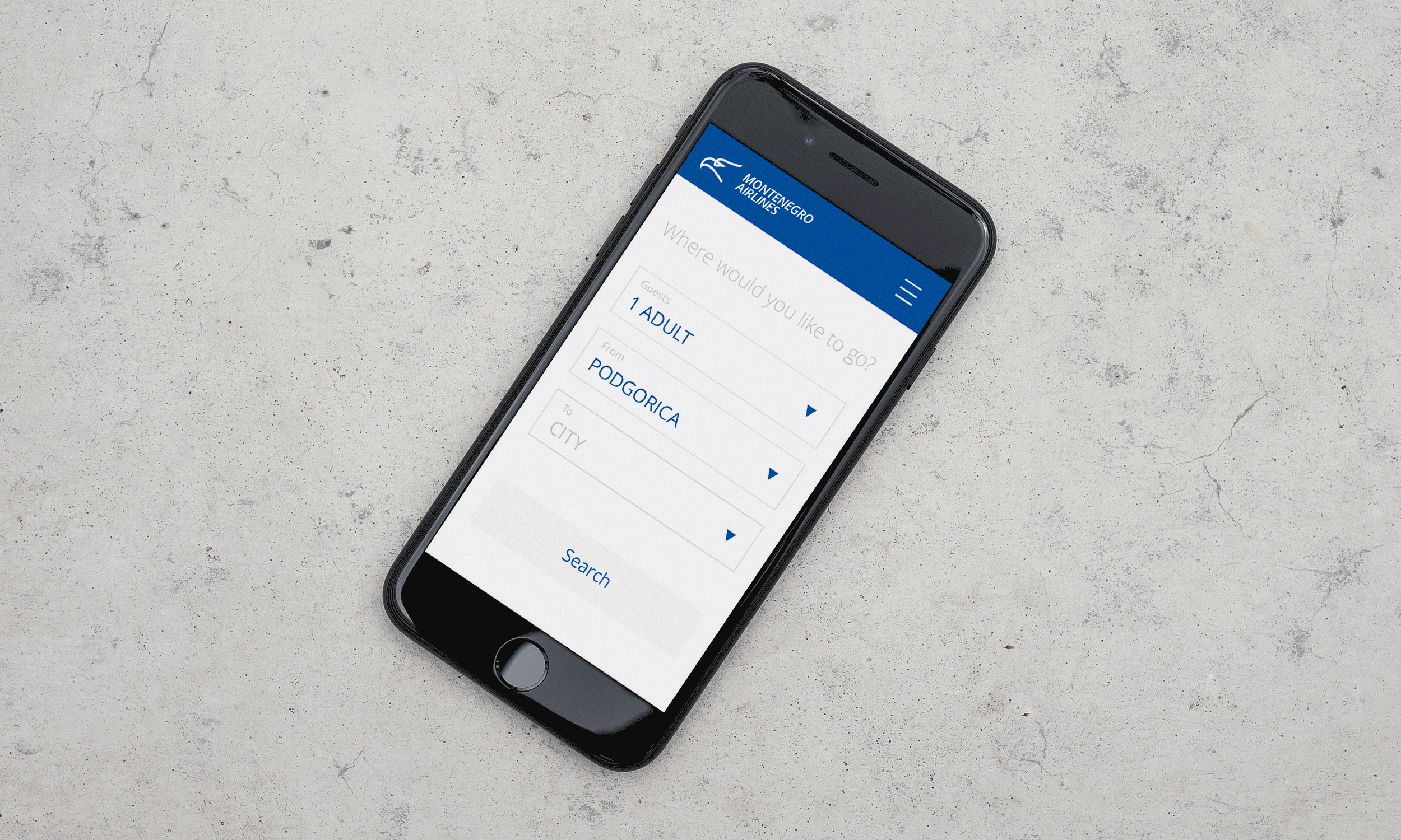
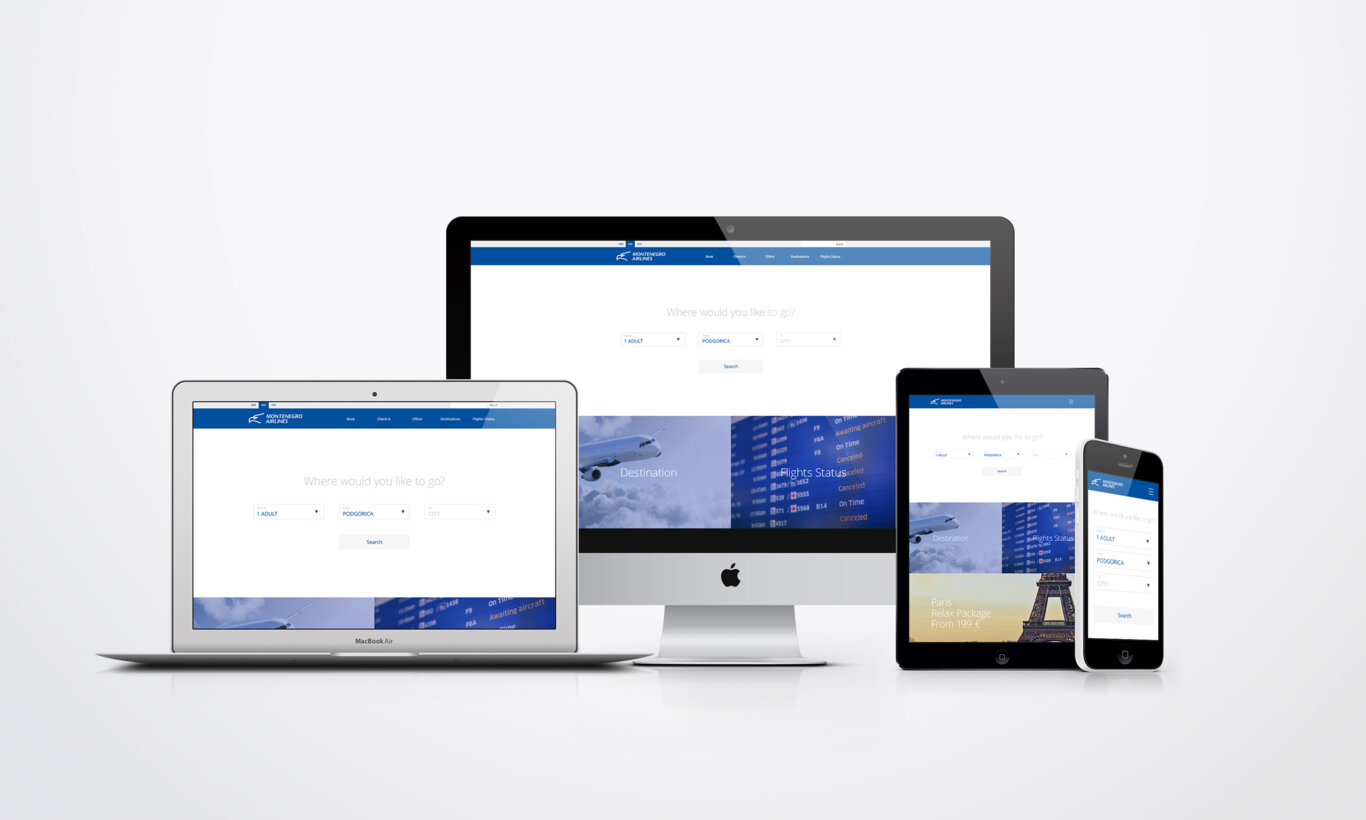
Brand improvement of a major national company has to be smooth. Our task was subtle: improving Montenegro Airlines' existing brand identity without making a lot of fuss.
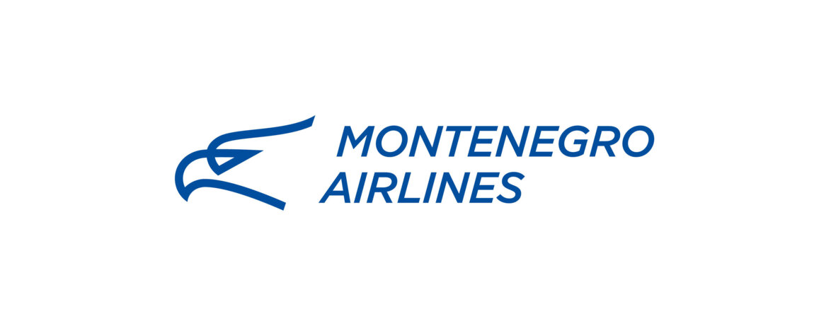
We started from the logo sign. Slight augmentation made the eagle more striking and determined, improving on the shape's aerodynamics. However, our main focus was typography. In the new version, the lettering is firmer and more grounded. This approach was then transferred to all stationery and promo materials.
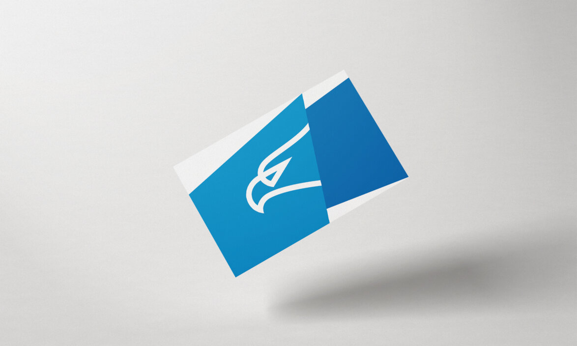
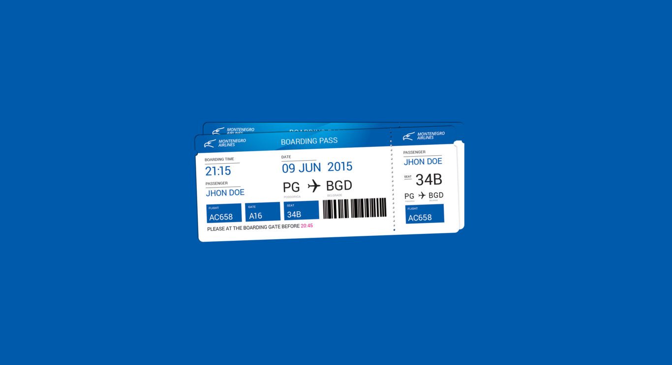
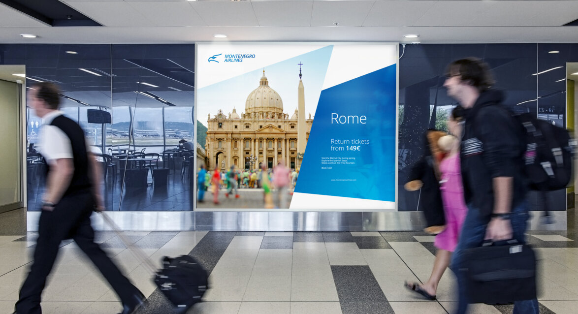
In keeping the original primary colour scheme, we've ensured a consistency in the transition to the new visual identity. The change was in the overall feeling: Montenegro Airlines is a company you can trust not because anyone says so, but because you feel it is the right company for you.
We like to think the results proved our point.